I’ve been trying to write a blog post about logo design tips and my logo design process for a while now, but life happens. It’s been about 13 years since I started working in my craft, and I have seen a lot of trends come and go. However, there are some principles that remain constant. Here are a few of my tips:
Client Discovery Meeting
The first thing we try to set up with a new client is a discovery meeting. This initial meeting helps make introductions and get the client’s thoughts on what they’re looking for. Sometimes, a client can provide great feedback on their mission, brand colors, and a sense of what they are looking for in a brand. Other times, we hear something like “modern vintage,” and for me, the first thing that comes to mind is a PT Cruiser, and just…no.

Often, we’re not given any limitations, which can become a blessing and a curse. On one hand, you have the ability to create something new and fresh, an opportunity to catch lightning in a bottle and surprise the client with something they hadn’t expected. On the other hand, it can be a challenge because you have to become a mind-reader to know what they want. Bring on the revisions!
Either way, having an established process helps a lot.
2 Rules of Logo Design
The key point to remember when it comes to initially designing a brand logo is to stay on trend with a hint of timelessness. Trends can be fickle things, and tricky tasks to approach. Simple and flat, embossed and heavy on effects, all lowercase with gradients, and…you get the point. What’s appealing today may look dated and ugly tomorrow. To help simplify the process, we focus first on two golden rules of logo design.
Golden Rule #1: The Typeface
The primary text for a logo should be made of a strong, legible typeface. This typeface needs to work well with secondary and tertiary fonts for headlines and body copy. If a person can’t read it, then what’s the point?
Golden Rule #2: The Mark
An icon and colors can help people immediately identify a brand in various media. These things work in tandem to push a brand from having an icon to being iconic. A logo should always be identifiable, from as small as a thumbnail to as large as a building.
Logo Design Examples
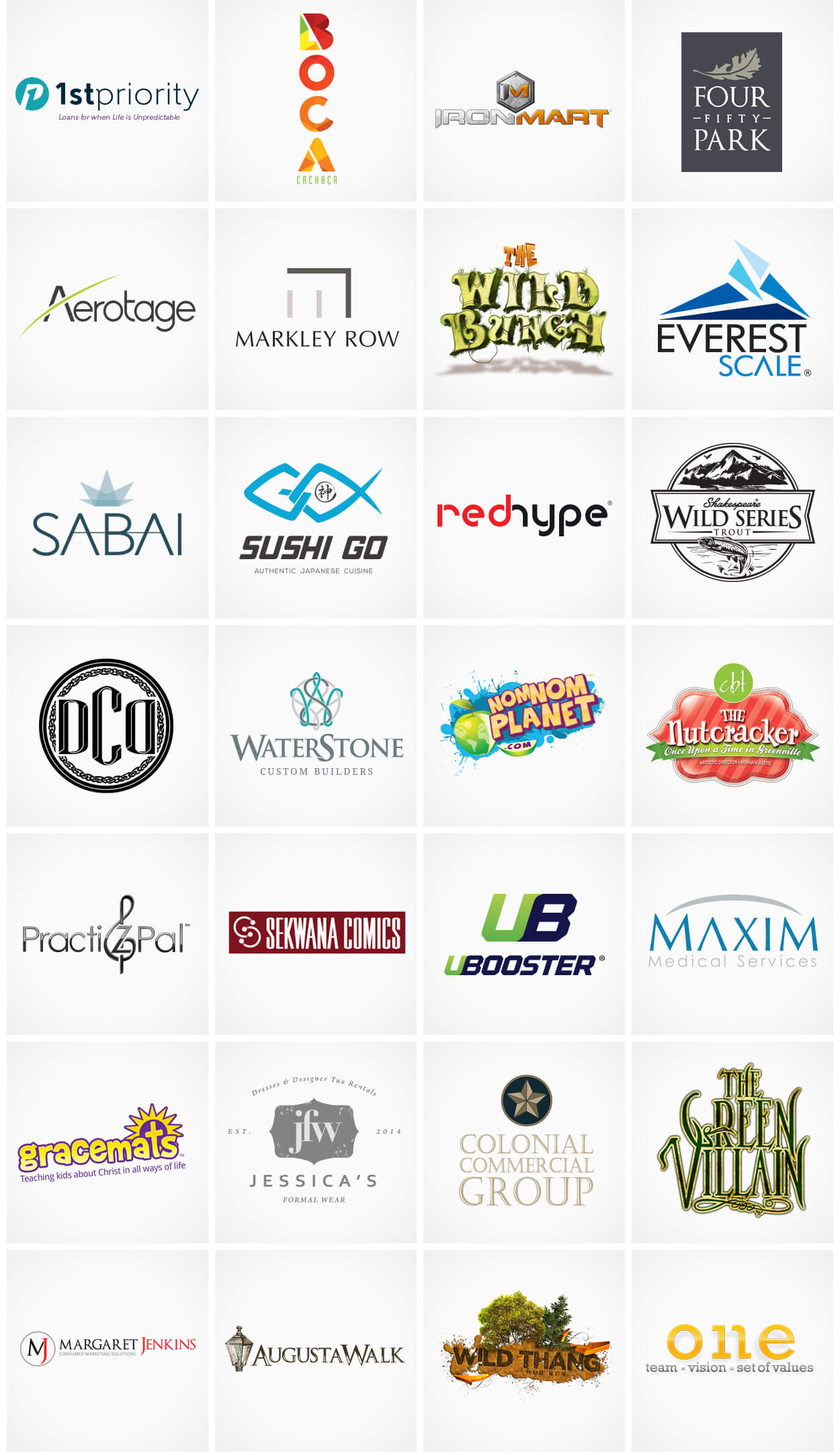
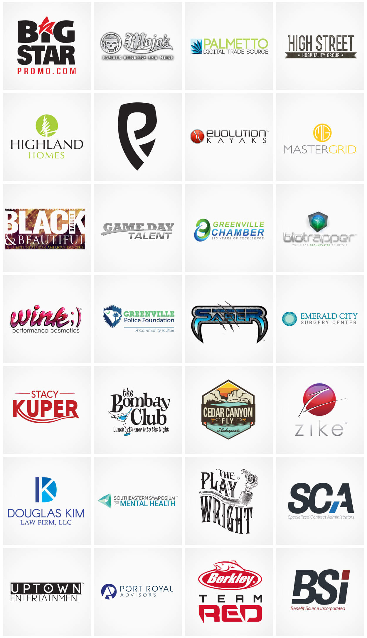
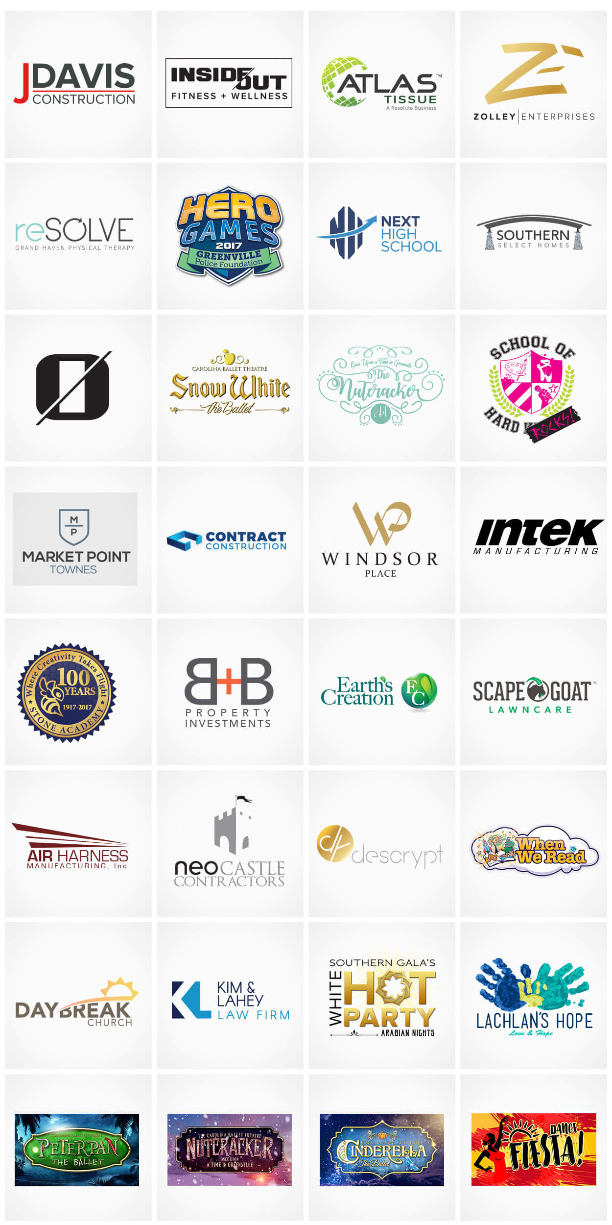
I learned early on that necessity spurs creativity, and some guidance is better than none. Having an open mind for a client’s vision can steer us to unexpected places…as long as it’s not in a PT Cruiser. Below are some examples of logos I’ve worked on over the years and while some can withstand the test of time, others haven’t quite aged like fine wine.


I hope these logo design tips helped you get an idea of the process. Not everyone has a designer on standby ready to help take their business to the next level. If that’s your situation, then we can be the one on standby to help you. Reach out to us on our contact page and let’s talk about how we can make your brand look even better than it already does.


